
Home: Week 1 : Good Typography Choices.
One of the drawbacks of digital media is having entirely too many choices.
With millions of colors, and hundreds of typefaces to choose from, only the most disciplined, or boring, individuals can resist the temptation to use every font on the menu.
Here are some good reliable examples of what not to do with type. As you work, check that you are not doing like any of the following examples, and you may just be on your way to some decent typography.
Honestly, you only need one or two fonts on a page. Maybe three. Maybe three. You will recognize this example of what not to do.
Click to enlarge.
That book cover uses something like eleven different fonts.
Using everything you have available in a design looks desperate, cheap, and undisciplined.
The best color choice for type is black type on white. The next best choice is white type on a black ground. This color combinations provide the most clarity, and the highest contrast, making the type easiest to read.
This doesn't mean that you shouldn't ever use colors in your typography. However too much color is distracting, and prevents your audience from reading what you have to say.
Notice how hard it is to read this XPEDX advertisement? Not only are there 4 too many fonts...the colors fight for attention on the black ground, making it very difficult to read.

Click to enlarge
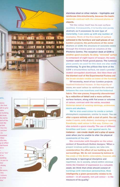
This is an excerpt from the Jan/Feb 2001 issue of "Frame" magazine.
The article discusses the use of vibrant colors in architectural design. The art director for this article has chosen to echo the subject of the article by making every paragraph a different color. Nice idea, but nearly illegible.
Click to enlarge
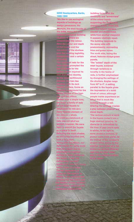
Here is another excerpt from the same "Frame" article. Here the art director has laid the hot pink type over a photograph.
Visually, the color choice is interesting, and relates to the subject of the article. But....The pink text is very close in value to the colors in the photograph. When seen in grey scale, the type is nearly indistinguishable from the background. Again, visually pleasing, but unreadable.
Click to enlarge
Don't feel restricted by these recommendations. You are free to use what ever horrible font and color combinations you desire.
If you sacrifice clarity and readability for style, you will lose your audience. Too-cool-for-the-room graphic design comes with the digital territory. Don't fall victim to it. The cooler something is today, the more likely it will be hated tomorrow, just think of David Cassidy.
And turn that music down. Damn kids.